Colorful icons

Colorful icons make full use of the Silver color palette. Colorful icons are not flat and incorporate elevation, shadows, and lighting.

Do: Use a variety of techniques to give your icon depth.

Don't: Don't make your icon flat. This makes it visually bland.
There are a variety of colorful icon types:
- 32px: Category, Preferences, MIME type, and Places icons
- 48px: Application icons
- 64px: MIME type, Places, Devices, and a few Status icons
Margins
Vertical
Colorful icons have a top and bottom margin of 4 pixels. Icons should not put any details here whatsoever.

Horizontal
Colorful icons also have a left and right margin of 4 pixels. Minor details can extend here as necessary.

32px colorful icons
32px colorful icons have a 2px margin instead of 4px margins.

Do: Use 2px margins on 32px colorful icons.

Don't: Don't use 4px margins on 32px colorful icons; this reduces the canvas size too much.
Anatomy
All colorful icons share the same basic anatomy.
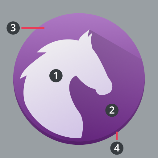
- Foreground
- Foreground shadow
- Base
- Base shadow

The foreground of an icon is the distinctive part that conveys the most branding.

Foregrounds on a background have a 45° shadow to the bottom right that spans the entire background.

Icons can have a background to serve as a base for their foreground.

The foreground, or the background if there is one, has a 1px hard shadow on the bottom.
Elements
Color
Icons can have a variety of shapes, which when combined with color, produce numerous unique arrangements.

Do: Color can be used to add variety to an otherwise bland surface.

Don't: Don't give color shadows; color is not shape and should not be treated as such.
Layers
Icons are composed of layers that cast shadows.

Do: Give icons at most two or three major layers.

Don't: Don't give icons too many layers.
Lighting and shadows
Ambient lighting
Icon fills should reflect ambient lighting, going from a lighter top to a darker bottom.

Do: Have gradients behave like light is coming from above the icon.

Don't: Don't have gradients behave like light is coming from below the icon.
Hard shadow
Every icon should have a 1px solid hard shadow. A good baseline color to overlay is black (#000000) at 10% opacity.

Do: Add a 1px hard shadow to give your icon depth.

Don't: Don't forget to add a hard shadow; this makes your icon seem flat.
45° shadows
Foregrounds should have a 45° shadow to the bottom right.

Do: Objects are solid, and block shadows from passing through.

Don't: Don't have shadows pass through objects; they are not glass.

Do: 45° shadows are bounded to their parent elements.

Don't: 45° shadows should not exceed the bounds of their parents.

Do: 45° shadows have a gradient that fades out before they hit an edge.

Don't: 45° shadows are not solid and do not extend to the edge of their parents.